Freestyle Libre
Personal project
App re-design
4 months
2024
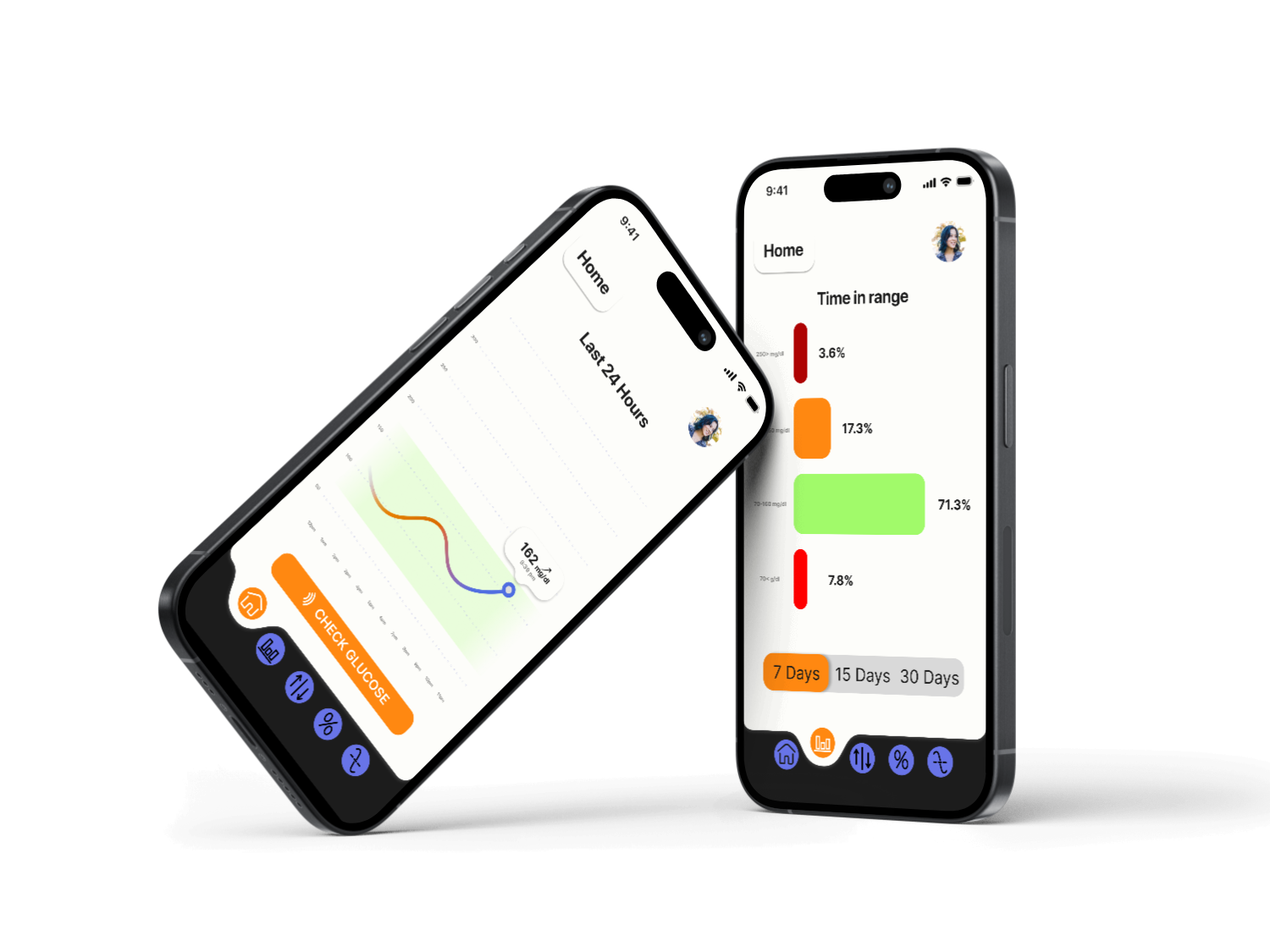
This project focused on redesigning an app to enhance its usability and visual appeal. The original design was cluttered, with repetitive layouts and buttons that made a harder user experience.
To address these issues, I adopted a user-centered design approach, ensuring that the redesign aligned with users’ needs and behaviors.
The process began by developing detailed user personas, which helped identify key pain points in the existing app.
I used Figma to create a complete prototype, designing all the screens from scratch while applying principles of visual hierarchy, balance, and consistency.
My primary goal was to create a cleaner, more intuitive interface that improves navigation and overall usability.
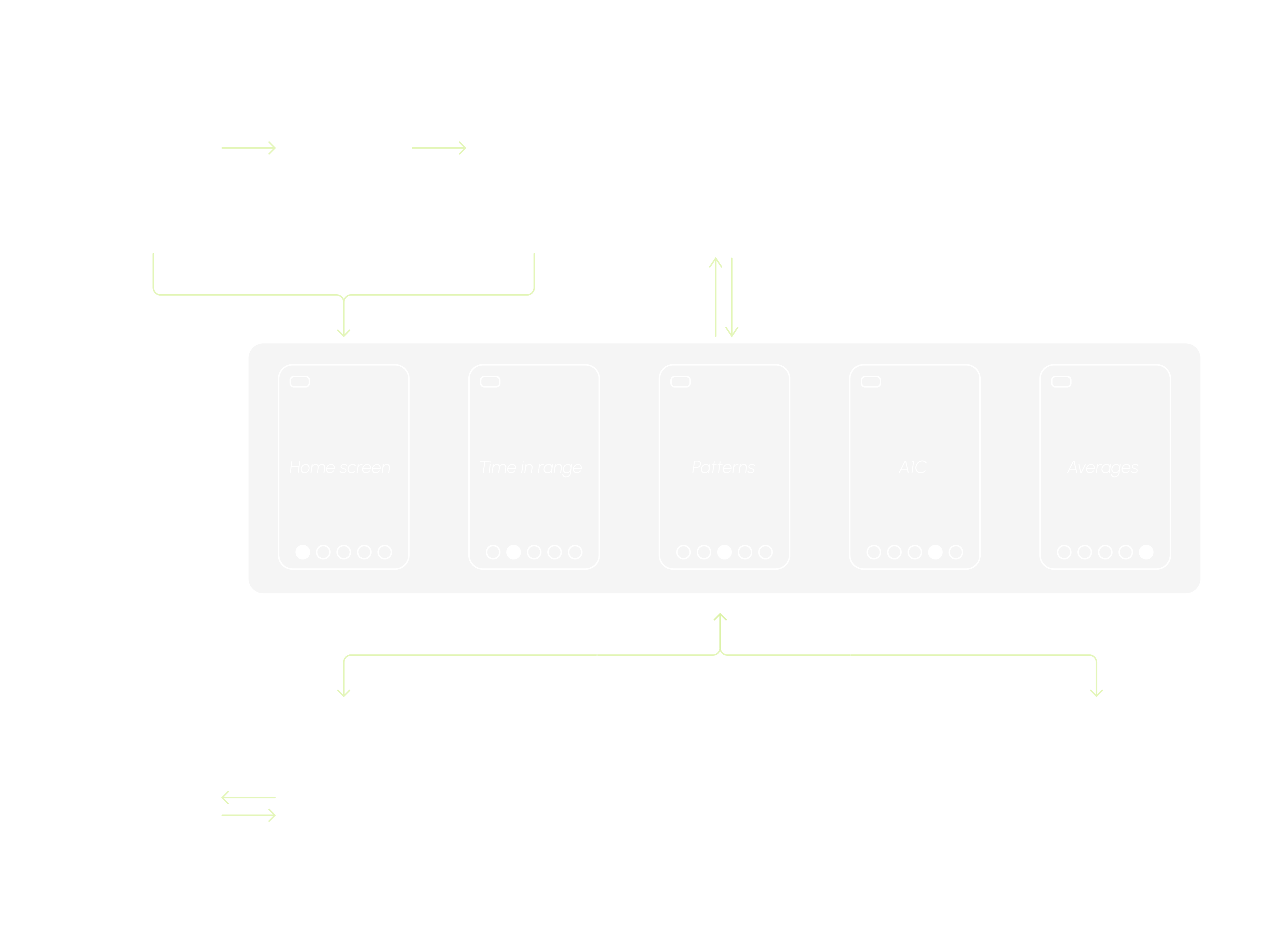
*project architecture
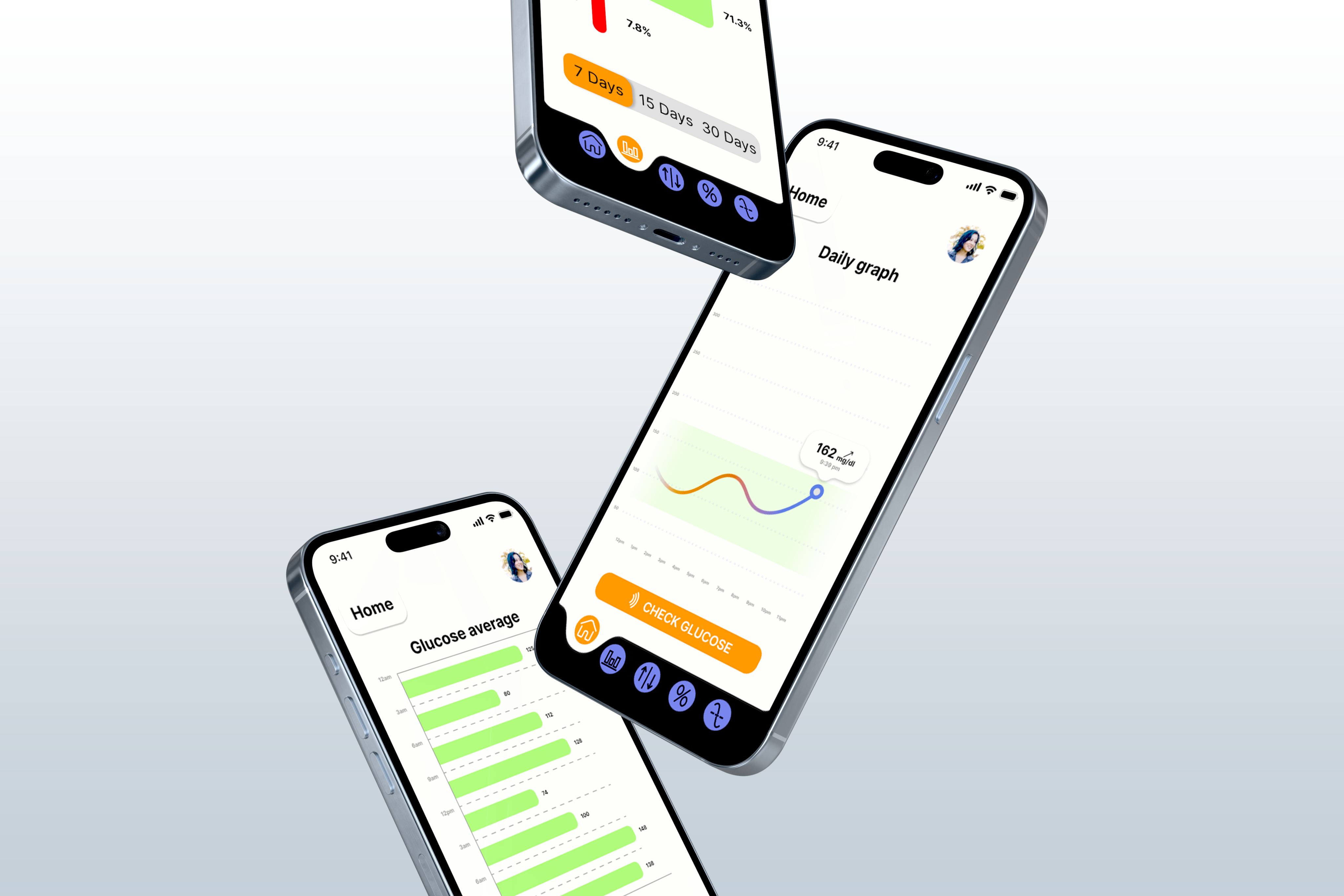
The redesign aimed to:
- Streamline the layout for simplicity and clarity.
- Create a cleaner interface with well-defined visual hierarchies.
- Optimize button sizes and positions to ensure they are functional without dominating the screen.
- Apply design principles such as consistency, proximity, and balance to improve the user experience.
- Enhance usability by reorganizing elements based on the app’s architecture, focusing on ease of navigation.
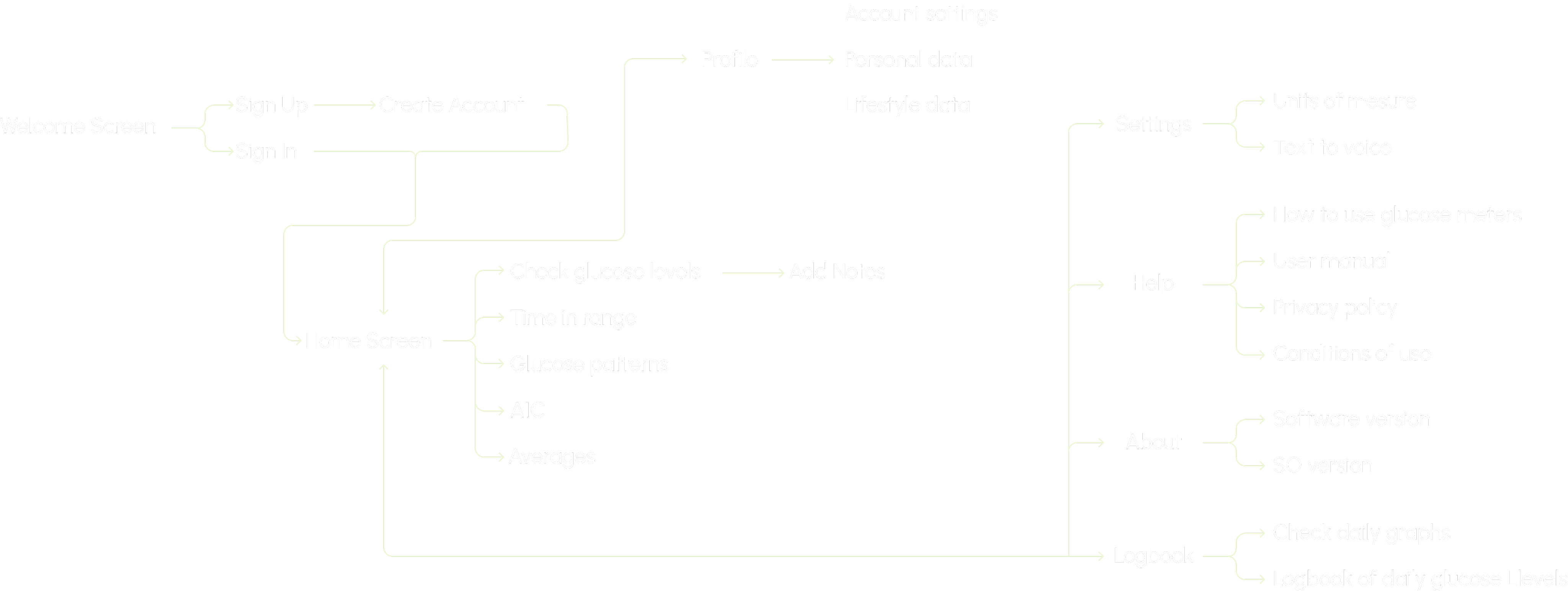
*user flow
User persona
Rogelio Méndez Fernández, 41 y/o Accountant
Rogelio is an accountant living in Mallorca, he is a father of 2 and has been a diabetic since he was a kid, he just started taking his health seriously and wants to make a change to live like a diabetes free person, he loves soccer, his family, going out to eat and he just started using subdermal glucose meters.
Pains:
- Dislikes the feeling of high blood sugar.
- Inconvenienced by the need to carry medicine and glucose meters with him at all times.
- He isn’t very tech-savvy and needs a straightforward, user-friendly solution.
Goals:
- Decrease the quantity of daily insulin intake.
- Play in an amateur men’s soccer league.
Motivations:
- To live a long and healthy life, aiming to reach 80 years old in excellent condition.
- To see his kids grow up and be involved in their lives.
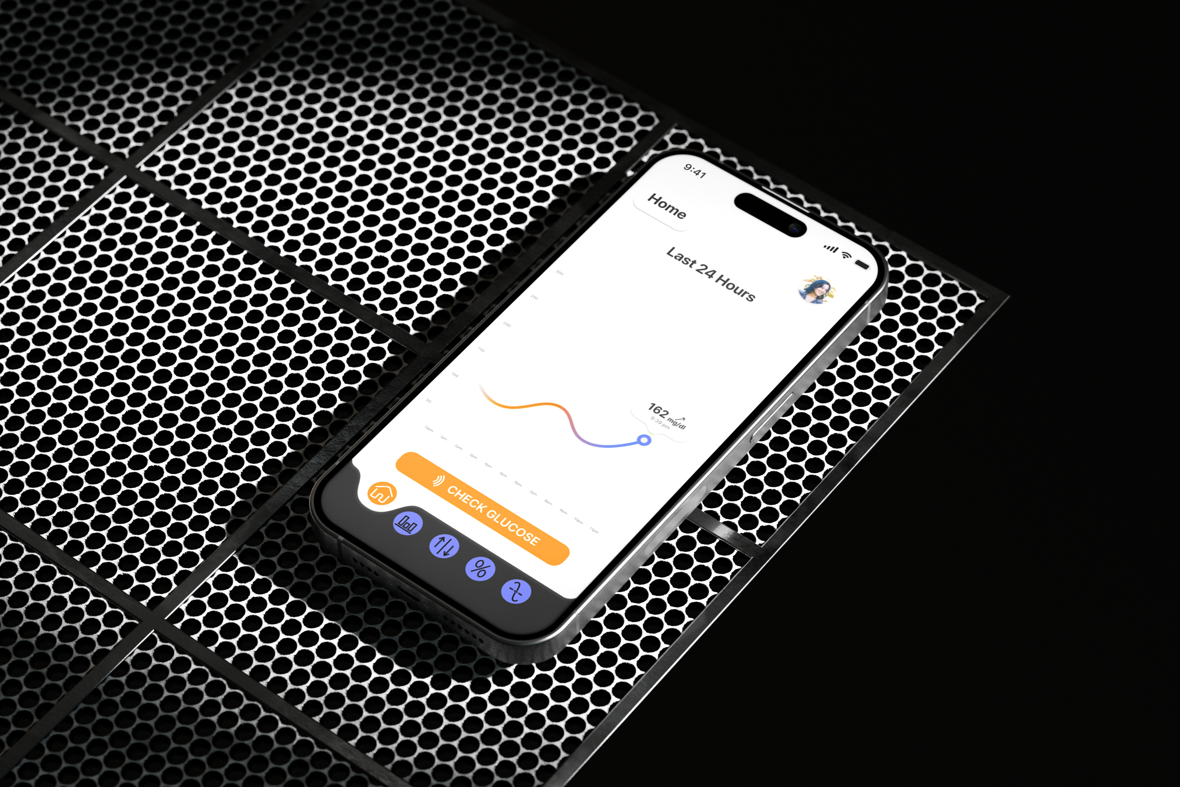
Streamlined Layouts: The redesigned features a cleaner, more cohesive layout, with each section clearly differentiated. This makes navigation intuitive and efficient.
Improved Visual Hierarchy: By applying design principles such as contrast and proximity, I created a clear visual hierarchy that guides users toward key information and actions. This makes the app more intuitive and enhances its usability.
Clean and Minimal Interface: The new design offers a minimalist, clean look, allowing users to focus on the content and tasks at hand without unnecessary distractions. The app feels more modern, which improves the overall user experience.
@ 2024 - 2026 Jaime Barba
Behance
Freestyle Libre
Personal project
App re-design
4 months
2024

This project focused on redesigning an app to enhance its usability and visual appeal. The original design was cluttered, with repetitive layouts and buttons that made a harder user experience.
To address these issues, I adopted a user-centered design approach, ensuring that the redesign aligned with users’ needs and behaviors.
The process began by developing detailed user personas, which helped identify key pain points in the existing app.
I used Figma to create a complete prototype, designing all the screens from scratch while applying principles of visual hierarchy, balance, and consistency.
My primary goal was to create a cleaner, more intuitive interface that improves navigation and overall usability.

*project architecture

The redesign aimed to:
- Streamline the layout for simplicity and clarity.
- Create a cleaner interface with well-defined visual hierarchies.
- Optimize button sizes and positions to ensure they are functional without dominating the screen.
- Apply design principles such as consistency, proximity, and balance to improve the user experience.
- Enhance usability by reorganizing elements based on the app’s architecture, focusing on ease of navigation.

*user flow
User persona
Rogelio Méndez Fernández, 41 y/o Accountant
Rogelio is an accountant living in Mallorca, he is a father of 2 and has been a diabetic since he was a kid, he just started taking his health seriously and wants to make a change to live like a diabetes free person, he loves soccer, his family, going out to eat and he just started using subdermal glucose meters.
Pains:
- Dislikes the feeling of high blood sugar.
- Inconvenienced by the need to carry medicine and glucose meters with him at all times.
- He isn’t very tech-savvy and needs a straightforward, user-friendly solution.
Goals:
- Decrease the quantity of daily insulin intake.
- Play in an amateur men’s soccer league.
Motivations:
- To live a long and healthy life, aiming to reach 80 years old in excellent condition.
- To see his kids grow up and be involved in their lives.

Streamlined Layouts: The redesigned features a cleaner, more cohesive layout, with each section clearly differentiated. This makes navigation intuitive and efficient.
Improved Visual Hierarchy: By applying design principles such as contrast and proximity, I created a clear visual hierarchy that guides users toward key information and actions. This makes the app more intuitive and enhances its usability.
Clean and Minimal Interface: The new design offers a minimalist, clean look, allowing users to focus on the content and tasks at hand without unnecessary distractions. The app feels more modern, which improves the overall user experience.
@ 2024 - 2026 Jaime Barba
Behance
Freestyle Libre
Personal project
App re-design
4 months
2024

This project focused on redesigning an app to enhance its usability and visual appeal. The original design was cluttered, with repetitive layouts and buttons that made a harder user experience.
To address these issues, I adopted a user-centered design approach, ensuring that the redesign aligned with users’ needs and behaviors.
The process began by developing detailed user personas, which helped identify key pain points in the existing app.
I used Figma to create a complete prototype, designing all the screens from scratch while applying principles of visual hierarchy, balance, and consistency.
My primary goal was to create a cleaner, more intuitive interface that improves navigation and overall usability.

*project architecture

The redesign aimed to:
- Streamline the layout for simplicity and clarity.
- Create a cleaner interface with well-defined visual hierarchies.
- Optimize button sizes and positions to ensure they are functional without dominating the screen.
- Apply design principles such as consistency, proximity, and balance to improve the user experience.
- Enhance usability by reorganizing elements based on the app’s architecture, focusing on ease of navigation.

*user flow
User persona
Rogelio Méndez Fernández, 41 y/o Accountant
Rogelio is an accountant living in Mallorca, he is a father of 2 and has been a diabetic since he was a kid, he just started taking his health seriously and wants to make a change to live like a diabetes free person, he loves soccer, his family, going out to eat and he just started using subdermal glucose meters.
Pains:
- Dislikes the feeling of high blood sugar.
- Inconvenienced by the need to carry medicine and glucose meters with him at all times.
- He isn’t very tech-savvy and needs a straightforward, user-friendly solution.
Goals:
- Decrease the quantity of daily insulin intake.
- Play in an amateur men’s soccer league.
Motivations:
- To live a long and healthy life, aiming to reach 80 years old in excellent condition.
- To see his kids grow up and be involved in their lives.

Streamlined Layouts: The redesigned features a cleaner, more cohesive layout, with each section clearly differentiated. This makes navigation intuitive and efficient.
Improved Visual Hierarchy: By applying design principles such as contrast and proximity, I created a clear visual hierarchy that guides users toward key information and actions. This makes the app more intuitive and enhances its usability.
Clean and Minimal Interface: The new design offers a minimalist, clean look, allowing users to focus on the content and tasks at hand without unnecessary distractions. The app feels more modern, which improves the overall user experience.
@ 2024 - 2026 Jaime Barba
Behance